

Achievements
Corporate website redesign with Next.js
Achievement summary
This summary provides the essential reading points. It does not replace the complete case study: scroll down to review the detailed context, steps, limitations, and critical review.
- Context
- 1UP Distribution's showcase website needed to move away from the Odoo builder to present the company more effectively to professional clients across screen sizes.
- Challenge
- Replace a constrained site with a credible B2B presence on every screen without sacrificing readability or accessibility to visual effects.
- My role
- I audited the existing site, formalized the requirements, analyzed the Figma mockups, then built the responsive integration and front-end architecture with Next.js.
- Key decision
- Move to a reusable-component Next.js architecture and reserve animation for moments where it genuinely supports the message.
- Result
- The redesign replaces constrained blocks with a continuous responsive interface, reusable components, and interactions that remain accessible without blocking information.
- Evidence
- Website screenshots, performance checks, and material from the linked experience make the achievement reviewable without exposing internal information.View the detailed evidence
Visual proof
Screenshots and demos from real projects.
Media 1 of 5
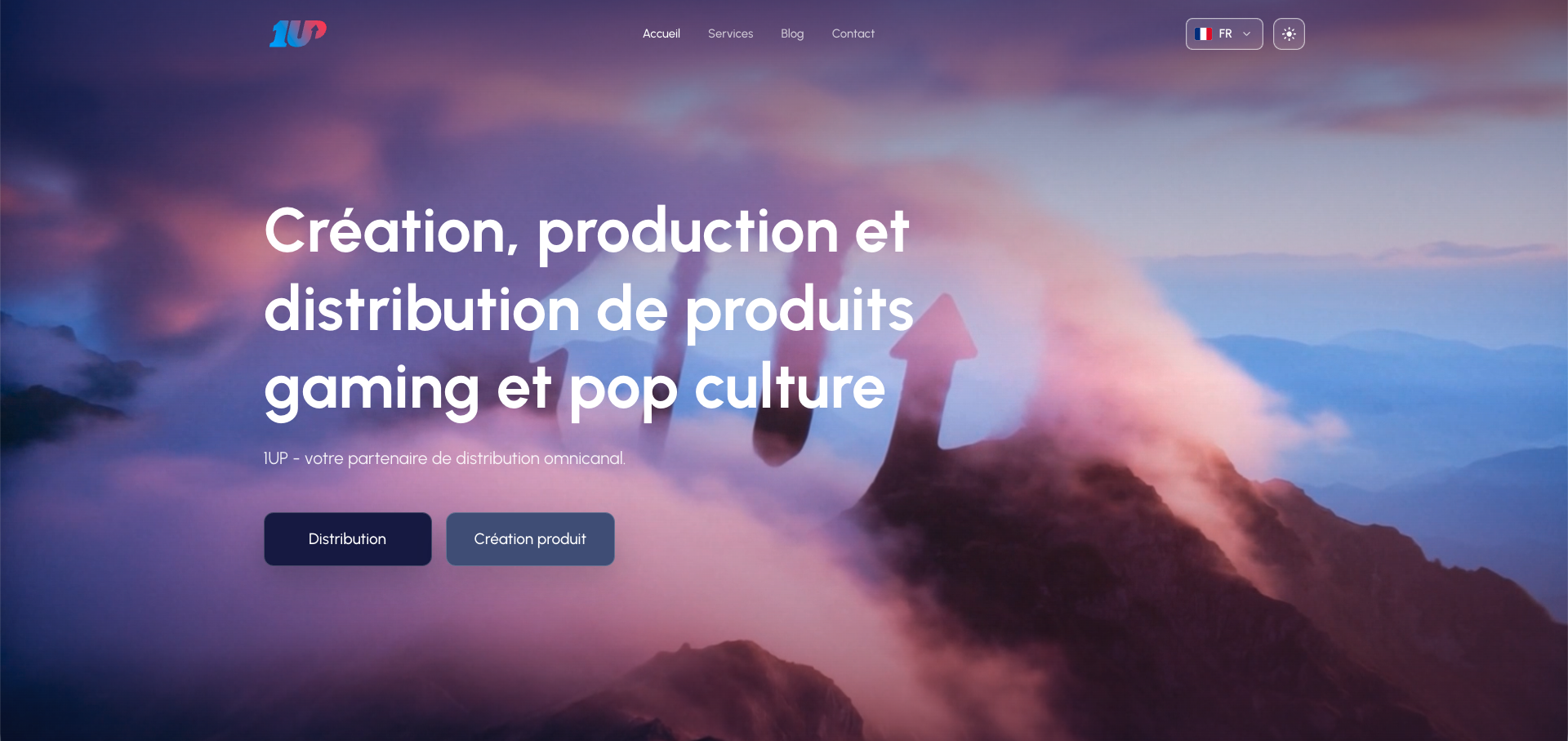
Video hero and positioning
First viewport of the corporate site, built around a video background, clear messaging, and distribution/product-creation CTAs.
01
Presentation
A showcase website intended for professional customers.
The 1UP Distribution corporate website presents the company, its business, and its ability to support commercial partners. A corporate website is not an online store: it explains positioning, services, brands, and the trust signals needed to understand the organization. Its main audience consists of professional customers, meaning companies that may work with 1UP rather than consumers directly purchasing a product. The site must also help attract new partners by providing a clear and credible view of the company.
A previous website built with the Odoo 16 builder.
The previous version was created using Odoo's integrated website builder. A website builder is a visual tool that assembles pages from blocks without developing the entire interface in code. This solution supports rapid creation of a site connected to the Odoo ecosystem, but it no longer provided the freedom sought for this redesign. The project required finer control over page structure, animation, behavior across different screens, and future code evolution.
A visual identity that had become dated.
The first gap concerned design. The overall appearance no longer matched the image the company wanted to present to professional contacts. The issue was not merely aesthetic: the perceived quality of a website influences trust in the information it presents. An outdated interface could suggest that the company, its services, or its communication had not evolved. The redesign therefore needed to create a more current presentation without turning the site into a visual demonstration disconnected from the actual business.
A message that no longer described the company accurately.
The old website's content no longer faithfully reflected the reality of 1UP Distribution. The company and its positioning had evolved, while the copy and information hierarchy remained tied to an earlier representation. A professional visitor could therefore misunderstand the activity or fail to identify reasons to make contact. The redesign needed to align the message, visuals, and evidence presented with what the company is today.
Insufficient mobile rendering.
The old website displayed poorly on phones. Responsive design is the ability of an interface to adapt its layout, text, images, and interactive areas to the width of the screen. It is not enough to shrink a desktop page: blocks must reorganize, buttons must remain usable, and important content must retain a readable hierarchy. This weakness could damage the experience of a prospect visiting from a mobile device and weaken the prospect's first impression of the company.
Insufficient search engine visibility.
When someone searched for the company name, the site appeared after other organizations with a similar name. Search engine optimization, or SEO, covers practices that help search engines understand a page and propose it for relevant queries. The initial observation was therefore concrete: 1UP Distribution's digital identity was not visible or differentiated enough. The redesign needed to provide a clearer foundation for presenting the right content, structuring pages, and progressively strengthening that presence.
Administration that had become too constrained.
Evolving the old website with the Odoo builder was considered difficult and unsuitable for the project's ambitions. The limitations involved more than editing text: every specific visual or behavioral change had to remain within the tool's intended framework. This reduced design freedom and made a genuinely custom experience more expensive to create. Changing the technical foundation therefore addressed a need for long-term control as much as a desire for immediate modernization.
An initiative led with the managing director.
The project was launched jointly with the managing director. I personally championed the redesign because I believed the old website no longer represented the company correctly and that retaining it in its existing state had become harmful. This reflects a proactive position: the request did not arrive as an already defined technical specification. I identified the problem, argued for the value of change, and then took responsibility for turning it into a feasible project with management.
Next.js as the new technical foundation.
I selected Next.js, a React framework for building web applications. A framework provides architecture, conventions, and common tools so that foundations do not need to be rebuilt for every page. Compared with the previous builder, this solution provides complete freedom over components, navigation, animation, responsive design, and optimization. The choice was therefore not simply about using newer technology: it made it possible to control the code precisely and adapt the site to graphic and marketing needs rather than to the limitations of a visual editor.
A bilingual launch rather than thirteen languages.
An early hypothesis considered a much larger number of languages, but the scope was reduced for the first release. The site will launch in French and English. A locale is the combination of language and conventions used to display content for a particular audience. Bilingual delivery already allows the company to reach a broader audience while limiting the amount of copy that must be produced, reviewed, and maintained before launch. Additional languages can be considered later if their commercial value justifies the effort.
A first release focused on the essentials.
The two pages identified as essential at the start are the homepage and contact page. The homepage must quickly explain who the company is, what it does, and why a professional might work with it. The contact page must turn that interest into a relationship. This scope avoids delaying the first release with additional secondary pages before validating the main message and the path leading a visitor to contact the company.
Graphic design produced by the company's specialists.
Mockups and visual direction were prepared by the internal graphic designers. My role was therefore not to claim their work, but to turn their proposals into a faithful, responsive, and high-performing web interface. This distinction matters: a static visual expresses an intention, while integration determines how components respond to different screen sizes, how animations flow, and how the whole remains accessible and maintainable.
Content responsibilities shared between marketing and management.
The marketing team was responsible for producing the copy. The marketing director and managing director validated the content and the site's overall image. This distribution ensures that communication reflects company strategy and that published claims can be supported. My responsibility was to identify web constraints, propose a readable organization, and coordinate content integration into the planned components.
Use of brands subject to their approval.
The site presents brands with which the company works. Their logos, products, or visuals cannot be treated as decorative resources that are automatically free to use. Their appearance must be covered by the relevant brands' approval and respect the image they authorize. This constraint requires coordination around available content, verification of what can be published, and avoiding a section that cannot legally or commercially be populated.
Deliberate separation from the ERP.
The corporate website does not display a sales catalog and therefore does not need to read Odoo products, stock, or orders. It is designed as an application independent of the ERP, reducing technical dependencies and avoiding a connection between two systems without a business benefit. Integration remains under consideration for contact form submissions. In that specific case, the connection would have a clear purpose: automatically forwarding an inquiry to the tool used by the company to process it.
A role as technical lead and coordinator.
I hold sole responsibility for development, but the project remains collaborative. As technical lead, I choose the architecture, turn mockups into components, protect performance, and organize implementation. As coordinator, I circulate requirements between graphic designers, marketing, the marketing director, and the managing director, then flag the decisions or content needed to move forward. This position connects the company's vision, graphic design, and the concrete construction of the website.
02
Objectives, context and stakes
Modernizing the company's image as the first priority.
The redesign pursues several objectives, but modernization comes first. The website must convey an image consistent with the company as it exists today from the first digital contact. Modernization is not limited to replacing colors or fonts: it concerns information hierarchy, page rhythm, integration quality, and the way activities are explained. Search visibility, partner acquisition, and contact generation remain important, but they first depend on a credible, contemporary presentation.
Making the dual business model clear from the first screen.
Within the first few seconds, a visitor must understand the role of 1UP Distribution and the nature of its activity. The company operates in distribution, meaning making products available through professional networks, as well as creating products related to pop culture, collectibles, and video game accessories. A collectible is a product designed to be collected, for example around a license or cultural universe. The opening message must make this positioning immediately clear without requiring the visitor to browse several pages.
Turning a visit into an inquiry.
The primary action sought is contact with the company. Content, partnership evidence, and the presentation of activities must lead visitors toward this conversion point. A conversion is the useful action completed after a visit, here sending a professional inquiry. The website is therefore not intended to retain users artificially with animation: it must answer their first questions, establish enough trust, and then clearly show how to begin a relationship with the team.
Attracting relevant B2B contacts.
The new contacts sought belong to the business-to-business (B2B) market, in which one company sells to or collaborates with other companies. They may notably include distributors and retailers. A distributor organizes product availability within a commercial network; a retailer sells those products to the final customer in physical stores or online. The website must use vocabulary, examples, and a level of evidence suited to these professionals rather than to an individual consumer.
Assessing contact quality rather than volume alone.
The relevance of the new image can be observed through the profile of companies that make contact. If inquiries come from organizations similar to the customers and partners 1UP already supports, the website will have communicated its positioning more effectively. This remains a qualitative indicator at launch, with no target number of form submissions currently defined. It nevertheless distinguishes an increase in low-value traffic from visibility that genuinely attracts the intended professional audience.
Preserving design without damaging the mobile experience.
The responsive objective is to preserve as much of the desktop mockups' intent as possible across computers, tablets, and phones. Some elements may nevertheless need to change size, layout, or behavior to remain readable and easy to use. User experience, or UX, takes priority when a graphic choice obstructs understanding, slows interaction, or occupies too much space on a small screen. The expected result is therefore neither a shrunken copy of the desktop version nor an impoverished mobile version, but an adaptation that preserves visual identity without creating friction.
Making 1UP Distribution stand out in searches for its own brand.
The main SEO objective is for the website to appear before companies with a similar name when a user searches specifically for “1UP Distribution.” This is a navigational query: the person already knows the name and is looking for the correct organization. The website should help search engines identify it through explicit content, coherent titles, suitable metadata, and an accessible technical structure. Improvement will then depend on indexing time and competition; deployment alone cannot guarantee it.
Maintaining a high level of performance.
A Lighthouse audit conducted during development produced scores of 99 out of 100 for performance, 100 for accessibility, and 96 for best practices. Lighthouse is an automated audit tool that analyzes a page according to several technical criteria. These results are a reference to preserve at launch rather than definitive proof obtained on the future production system. They must be checked again with the final domain, hosting, assets, and content because those elements can change observed performance.
Publishing only validated commercial information.
Statistics that appeared in certain mockups were dummy text used to test visual composition. They must not be used as evidence in the portfolio or published on the website until verified. Dummy text is provisional content that occupies the space intended for future copy during design. The objective is therefore to separate real data clearly from demonstration material and have every commercial claim approved by marketing and management before launch.
Structuring the homepage around three essential types of content.
To be considered complete, the homepage must present the company, its partners, and its activities. The company presentation answers “who are we?”; the activities explain distribution and product creation; and partners provide concrete trust signals, subject to their authorization. These three groups must form a coherent story leading toward contact rather than a collection of unrelated sections.
Building a sufficiently precise contact form.
The form must collect the inquiry subject, a free-text message, email address, first name, and last name. The telephone number remains optional so the visitor can choose the preferred response channel. Every field must support processing the request without unnecessarily requiring personal information. The functional objective is to give the team enough context to understand who is contacting the company and why while keeping the journey short.
Determining the reception workflow before launch.
The person or team that will receive inquiries has not yet been selected definitively. This is one of the decisions remaining before the first release. The form will only be operational if every message reaches a monitored mailbox or tool with clear responsibility for reading and answering it. Possible forwarding to Odoo can be assessed based on this workflow, but it should not delay the form if a simpler delivery method addresses the initial need.
Preparing an initial production release during summer 2026.
The target period for launch is summer 2026. This deadline provides a framework without requiring every feature to be included before release. The bilingual scope, focus on the homepage and contact page, and progressive copy approval concentrate work on a first version that is genuinely presentable. Non-essential content or pages can be added after launch rather than blocking the entire release.
Obtaining explicit editorial and visual approval.
For the managing director and marketing director, the website can be approved when final copy has been accepted and the design has been integrated in a way that matches the intended image. This validation combines two different dimensions: message accuracy and visual implementation fidelity. A technically fast website carrying unapproved copy would not be ready; similarly, an approved mockup poorly adapted to the browser or mobile would not meet the requirement.
Combining modernity, visibility, and commercial effectiveness.
The overall objective is to build a modern digital presence that explains the business correctly, works across screens, progressively improves brand visibility, and facilitates B2B inquiries. None of these outcomes should come at the expense of another. Animation that damages UX, copy optimized for search engines but unnatural for visitors, or a form with no responsible recipient would work against the project. Success therefore depends on balancing image, technology, and commercial use.
03
Risks and mitigation measures
An unfinished design as the main risk.
The first risk to the planned summer 2026 launch is that the graphic design may not be fully completed. While certain mockups, responsive variants, or visual decisions remain open, I cannot finalize the corresponding integration. Developing an unstable section too early would waste time if its structure later changes, while waiting for every decision could delay the entire project. Managing this risk requires prioritizing the screens essential to V1 and progressively approving blocks that are sufficiently defined.
Editorial approval as the bottleneck.
Copy and its approval by marketing and management are the project's main bottleneck. A bottleneck is the stage whose capacity or speed limits the progress of everything else. A page may be technically complete but still impossible to publish if its message has not been approved. This risk requires making missing content visible, submitting copy early enough, and distinguishing what genuinely blocks launch from what can be improved after the first release.
Brand visuals dependent on authorization.
A brand may refuse to allow its logo, products, or visuals to appear on the website. In that case, the company will not publish them and will feature other partners whose assets are authorized for use. The risk is therefore not blocking the entire project, but having to adapt a section or its composition when intended content becomes unavailable. Mockups must remain flexible enough to replace an item without rebuilding the complete component, and rights approval must occur before final publication of assets.
Accidental publication of dummy content.
Mockups may contain provisional numbers, names, or text used to test the layout. If mistaken for real information, the website could publish a false claim and damage the company's credibility. To limit this risk, every piece of content is double-checked with the team responsible for copy approval. Provisional values must also remain identifiable during development so that review does not depend solely on participants' memory.
A V1 scope protected from continuous feature additions.
Uncontrolled expansion of scope, sometimes called scope creep, can delay delivery by adding new requirements during implementation. A clear decision limits this risk: additional features will belong to a separate V2. The first release remains focused on the homepage, contact, bilingual delivery, and the content required for approval. This separation records useful ideas without allowing them to challenge the initial release date.
Complex mobile adaptation for rich graphic elements.
Animation, motion design, and large background elements are the most difficult content to transfer to a small screen. Motion design uses movement to create rhythm or explain a visual transition. A composition that works on desktop can hide text, occupy too much space, or lose meaning when reduced. The response is to adapt the size, position, or behavior of these elements and simplify some of them when necessary to protect readability and interaction.
Performance dependent on animation quantity.
The video hero, carousels, and GSAP animations are not considered a problem as long as their number and cost remain controlled. Risk appears when too many effects run simultaneously, load large assets, or continuously use browser resources. A page can score well with provisional content and then slow down when final media are added. Effects must therefore continue to support the message, assets must be optimized, and Lighthouse measurements must be repeated using the version genuinely intended for launch.
Reduced-motion support that remains inconsistent.
The repository already contains initial support for the prefers-reduced-motion system preference: some Motion components disable their effects, some videos use a still-image fallback, and a Playwright test verifies this behavior on part of the corporate pages. However, coverage is not yet consistent across every historical animation, particularly those driven directly by GSAP, page transitions, and Lenis scrolling. V2 should harmonize these mechanisms and provide lighter behavior for low-powered devices or slow connections. Until then, no essential information should depend on motion alone.
Accessibility risks related to animation and contrast.
The final design may create insufficient contrast between text and its background, particularly when text overlays video or a large visual. Animation can also distract, make reading difficult, or change an interface too quickly. Automated scores provide an initial check, but they do not replace visual review of contrast, readability, and keyboard navigation. Every final graphic decision must be tested against these uses before approval.
A migration that may affect search visibility.
Replacing the old website can cause the company to lose some of its existing search visibility if pages disappear, their addresses change without redirects, or search engines temporarily encounter a non-indexable version. A permanent redirect tells visitors and search engines that an old URL has moved to a new one. Before the switch, useful URLs must therefore be inventoried, retained where possible, redirected when changed, included in a coherent sitemap, and checked to ensure temporary blocking rules used during development do not remain active.
Bilingual consistency dependent on marketing.
The marketing team produces and approves the French and English versions. The risk goes beyond a translation mistake: two languages may end up presenting different offers, numbers, or calls to action when one is modified without the other. Content must therefore be tracked as two versions of the same message and approved together before every important publication. A missing translation key or French copy left on the English page must also be detected during testing.
Several risks concentrated in the contact form.
The form can receive spam, lose a message during an error, send an inquiry to the wrong address, expose personal data, or depend on a temporarily unavailable delivery service. These risks concern security, confidentiality, and continuity of the commercial journey. Implementation must therefore validate received data, limit automated submissions, transmit messages through a protected channel, display an understandable result to the user, and log enough error information to diagnose an undelivered inquiry without unnecessarily exposing its content.
An unknown recipient, but not a current blocker.
The final form destination is not yet known because the decision must be made with the relevant managers. This missing information does not currently slow development of the interface or field validation. It will nevertheless become a mandatory criterion before production release: an address, shared mailbox, or tool must be chosen, tested, and assigned to someone responsible for processing inquiries. The topic is therefore a pending decision rather than a major project risk.
A possible return to the old website if the switch fails.
If the new website encounters a major issue during launch, the old website can remain available or be restored. This rollback limits the time during which the company might have no functioning presence. The option must be prepared by retaining the old version and the settings required to operate it until the new site has been validated under real conditions. It does not replace testing of the new release, but it reduces the impact of a critical defect discovered too late.
Future dependency on a single technical owner.
I am currently the project's only developer. This arrangement accelerates some decisions, but it creates a risk if no other developer is available to take over maintenance. A feature change, incident, or dependency update could then wait for my intervention. Reducing this risk requires structured code, clear version history, installation and deployment documentation, and sufficiently standard choices so that a new developer can take over without understanding every decision through oral discussion alone.
A future Odoo connection to treat as a sensitive workstream.
Forwarding forms to Odoo would create an additional dependency between the public website and the internal ERP. It would need to verify the calling service's identity, restrict granted permissions, validate all received data, and handle temporary Odoo unavailability without silently losing an inquiry. This integration is not required for the first release and should be implemented carefully as a separate workstream. Its benefit must justify the exposure and complexity added compared with simple delivery to a monitored mailbox.
04
The steps — what I did
Auditing the existing site before choosing a solution.
The first step was an audit of the old website. I reviewed its design, how it presented the company, its mobile behavior, search visibility, and the limitations encountered when evolving it with the Odoo builder. An audit observes the actual state of a system according to several criteria in order to distinguish symptoms from causes. This analysis allowed me to justify a complete redesign rather than a simple graphic refresh and connect each technical choice to an identified problem.
Formalizing the requirement in a specification.
The audit findings were turned into a specification. This document provides a shared reference for management, marketing, graphic designers, and development. It describes the expected result, features to plan, and constraints to respect without necessarily imposing every implementation detail. This step prevents the project from relying only on verbal discussions and makes it possible to compare design proposals or technical decisions with the original requirement.
Receiving and analyzing Figma mockups.
Graphic designers provided mockups in Figma, a collaborative interface design tool. Desktop, tablet, and mobile versions were already represented, providing a clear intention for the main formats. My work was then to analyze spacing, typography, colors, repeated components, and implicit behavior between two screen sizes. A mockup does not describe every possible width or every interactive state, so integration had to extend the designers' decisions without distorting their intent.
Turning three mockups into a continuous responsive experience.
Figma variants served as reference points, but the website had to work across every intermediate dimension. I used Tailwind CSS responsive classes to evolve grids, margins, text sizes, and element order at different breakpoints. A breakpoint is a width from which the layout adopts a new organization. I also checked for horizontal overflow and created alternatives, such as replacing a complex timeline with stacked cards on narrower screens.
Initializing the stack from documentation.
The project was started with Next.js 16 and React 19 by following the documentation for the selected tools. I used the Next.js App Router, which organizes pages and layouts from the app directory tree. TypeScript adds code typing, Tailwind CSS provides styling rules, and specialized libraries are added only for an identified need. Documentation helped me understand official conventions before assembling the stack rather than reproducing a configuration without understanding its implications.
Building a reusable component system.
The code is divided into interface primitives, layout elements, homepage sections, forms, corporate components, and global providers. Primitives include Button, Container, FadeIn, AnimatedText, and GlowSurface. Brand colors, semantic colors, and shared dimensions are centralized in the design system's CSS variables. This organization avoids redefining a button or container on every page and ensures that accessibility or style improvements can be applied to multiple uses from a single component.
Separating server and interactive components.
Pages and elements that require no interaction remain Server Components, meaning components rendered on the server without unnecessarily sending all their logic to the browser. Components using animation, a form, or local state are declared as Client Components. This boundary is visible in the repository: pages retrieve content and metadata on the server, while Hero, BrandCarousel, FadeIn, or ContactForm handle client-side interactions. This separation reduces the JavaScript sent when interactivity is not required.
Distributing animation work between GSAP, Motion, and Lenis.
GSAP handles complex sequences, scroll-based reveals with ScrollTrigger, and draggable logo carousels with Draggable. The hero successively animates the title, subtitle, and calls to action, while certain sections reveal themselves as they enter the viewport. Motion handles more local effects such as page transitions and component appearances. Lenis drives smoother scrolling. This distribution avoids asking one library to solve every need and preserves targeted animated components rather than one global animation system that would be difficult to control.
Creating interactions without blocking content.
Brand and retailer carousels use the GSAP Draggable plugin. Users can move a logo; its velocity is calculated on release, after which it briefly continues moving before returning to its position. GSAP reveals use a scope limited to the component, and elements remain visible when reduced motion is requested. Newer corporate components also use useReducedMotion to remove non-essential movement. The objective is to create visual richness without making information dependent on animation.
Integrating video and images according to their purpose.
The hero uses a muted, autoplaying, looping HTML video as its background and supports inline playback on mobile. A dark overlay improves text readability, and a caption track is declared. For images and logos, the project uses the Next.js Image component with dimensions or sizes hints suited to different screens. Local visuals are notably converted to WebP. Images from Sanity are generated with a target width and automatic format. Some newer video components load metadata only and replace video with its poster when a user requests less motion.
Implementing centralized internationalization.
Routes use a dynamic language segment and next-intl loads the corresponding messages file. Internal links use locale-aware navigation, the HTML document receives language and direction attributes, and interface text is grouped in JSON files. The code was initially prepared for thirteen locales. The product decision is now to limit V1 to French and English; routing configuration, alternates, sitemap, and structured data must be aligned with this new scope before launch.
Organizing content between translation files and Sanity.
Stable interface and homepage text is currently read from next-intl message files. The project also integrates Sanity, a CMS or content management system, for articles, careers, and more editorial corporate pages. Schemas define pages, sections, brands, FAQs, settings, and SEO metadata, while public queries exclude content marked as placeholders. Pages can use translated copy as a fallback when no published Sanity content is available. This architecture is intended to let marketing evolve structured content without editing code directly.
Building a technical SEO foundation.
Pages define their titles, descriptions, canonical URLs, and language alternatives. The site generates a sitemap, robots.txt, and JSON-LD data describing the organization, website, breadcrumbs, pages, articles, job offers, or FAQs depending on context. JSON-LD is a structured-data format that helps search engines understand the nature of content without changing its visual presentation. Final migration work must still reduce this information to French and English, review old-site URLs, and add the required redirects.
Developing a first functional contact workflow.
The form already has an interface, sending, success, and error states, and a consent checkbox linking to the privacy policy. It sends data to a Next.js API route that checks required fields and the email address, removes line breaks from the subject, and sends an email through Resend using a React Email template. Routing currently distinguishes development from production inquiries. This first version still needs to be aligned with the final requirement: split first and last names, add the optional phone number, choose final recipients, and complete protection against unwanted submissions.
Testing components, the API, and real workflows.
Vitest and React Testing Library cover isolated components and functions, while Playwright runs browser scenarios. The Playwright configuration includes Chromium, Firefox, and WebKit as well as Pixel 7, iPhone 13, and iPad profiles. Existing scenarios notably check the homepage, navigation, form, absence of horizontal overflow, image loading, structured data, and some reduced-motion behavior. This combination detects both a logic error and a break visible only in a particular browser or screen width.
Measuring Lighthouse after every major stage.
I rerun Lighthouse after major project stages and especially after frontend changes. This frequency makes it easier to identify the regression that lowered a score, such as a heavy image, additional JavaScript, degraded contrast, or poorly structured element. The audit is not reserved for the end, when the source of a problem would be harder to isolate. Current scores provide a reference, after which a new audit must be run with final content and actual hosting conditions.
Preparing deployment on Vercel without locking the project in.
The planned host is Vercel, a platform suited to deploying Next.js applications. The repository indicates that an update to the main branch triggers production, making Git history the source of deployment. However, the company may later move the website to one of its dedicated servers. Code and environment variables must therefore remain documented so that changing hosts does not require rebuilding the application or losing external services such as Sanity or Resend.
Continuing through prototypes while awaiting final content.
The project is currently at a stage where I am waiting for marketing copy while testing several frontend design prototypes. This parallel work allows progress on components, responsive behavior, and visual directions without presenting provisional copy as approved. Before production release, the remaining work is to select and complete the design, integrate approved content, reduce the language scope to two, finalize the form, obtain marketing and management approval, and then rerun tests and audits on the release candidate.
05
The stakeholders — interactions
A small team with complementary responsibilities.
The project brings together two graphic designers, the marketing director, the Chief Executive Officer, and me as technical lead. The designers create the visual world and prepare the resources required for integration, marketing owns the company's message, management sets the direction, and I turn those decisions into a usable, fast, and maintainable website. This organization distinguishes creative responsibility, editorial responsibility, strategic decision-making, and technical implementation while requiring every participant to account for the constraints created by the others.
Two graphic designers responsible for preparing visual resources.
The two designers produce the mockups and assets that I integrate. An asset is a visual resource ready to be used on the website, such as a logo, image, video, texture, icon, or graphic composition. Their work therefore involves more than suggesting an overall intention: they must also provide usable material in formats, dimensions, and quality levels suited to the Web. I remain responsible for how those resources behave on the actual page, particularly across screen sizes, loading conditions, and possible interactions.
The lead graphic designer as my main visual counterpart.
My main contact for mockups is the lead graphic designer, meaning the person who coordinates visual direction and maintains consistency between the different proposals. This gives me a central point for questions about spacing, proportions, planned animations, or the priority between multiple elements. The role prevents two conflicting design comments from being applied directly in code without a shared decision.
Iterations made easier by working in the same office.
We work in the same office. Instead of waiting for a formal meeting to discuss every detail, we can regularly show each other our progress and iterate immediately. An iteration is a short cycle in which a proposal is presented, discussed, modified, and then checked again. A designer can observe how a mockup actually behaves in a browser, while I can directly explain why an effect works differently on mobile or why an overly heavy element harms loading speed. This proximity shortens the time between identifying a problem and correcting it.
End-to-end technical ownership.
I am solely responsible for development and make decisions concerning architecture, components, libraries, responsive behavior, tests, technical search optimization, and deployment. I personally validate the necessary adaptations when a mockup does not precisely describe a screen or behavior. This autonomy does not mean that I freely change the visual intention; it means that I choose the most appropriate technical method to preserve it across devices without degrading the user experience.
The marketing director as editorial owner.
The marketing director is my main counterpart for copy and its consistency with the company's positioning. Content that must be produced, corrected, or approved is tracked in Jira. Jira is a project-management tool in which each work item can be described in a ticket, assigned, prioritized, and moved according to its progress. This formalization matters because the code may be ready while the website still cannot be published if a title, activity description, or commercial message remains provisional.
A shared decision when design meets a technical constraint.
When a visual intention creates a performance, accessibility, or feasibility issue, I first seek agreement with the marketing director. I explain the desired effect, the observed constraint, and the available options so that the decision is neither purely aesthetic nor purely technical. If we cannot agree on a compromise, the Chief Executive Officer arbitrates. This process protects the intended image while making the concrete consequences of a decision for users and website behavior visible.
Animation as a concrete subject for compromise.
Animations make the website feel more alive and contribute to its identity, but their libraries and media consume resources: they can increase downloaded JavaScript, place more demand on the graphics processor, or slow rendering on a less powerful device. My role is to find an appropriate balance between visual richness and performance. This may involve limiting animation to elements that truly matter, using a less expensive transformation, deferring its loading, or simplifying it on mobile and for people requesting reduced motion. I present these trade-offs to the people responsible for the company's image so that optimization is not perceived as an unexplained loss of design.
Specific autonomy over responsive behavior.
Adaptation choices for different screen sizes fall under my technical responsibility. Responsive design means evolving the layout according to available space so that content remains readable and interactions remain usable on computers, tablets, and phones. When directly transposing a desktop composition would cause overflow, unreadable text, or difficult navigation, I can rearrange blocks, reduce certain effects, or change their order. I then check that the adaptation remains faithful to the visual hierarchy defined with the designers.
Marketing ownership of brand rights.
The website must present partner brands, but public use does not depend solely on the technical ability to display their logos. The marketing team verifies and obtains the required permission to use the names, logos, and visuals concerned. For my part, I only include resources whose use has been confirmed in the publishable release. If permission is missing, the brand is removed or replaced rather than presented as a partner without approval.
The Chief Executive Officer as owner of direction and approval.
The Chief Executive Officer is involved in project direction, prioritization, and approval. He confirms that the website supports company strategy, decides how important the work is compared with other projects, and arbitrates when a decision exceeds the technical or marketing scope. He also provides final authorization for production release. Going live is therefore not triggered merely because development is finished; it is a company decision that publicly commits its image.
Ownership of infrastructure and deployment.
I manage the domain name, DNS configuration, Vercel, and the broader technical hosting decisions. DNS, or the Domain Name System, associates the site's readable address with the service that must answer visitors. Vercel currently builds and hosts the application from the code repository. This responsibility allows me to tie production deployment to a precise and tested version while preparing for a possible future move to a company-owned dedicated server.
A contact workflow shared between technology and the business.
I build the form, its validation, the technical delivery, and the states shown to the user. However, marketing or the Chief Executive Officer must decide who will actually receive inquiries because that choice depends on commercial organization rather than code. This separation prevents me from deciding a prospect-handling workflow by myself. Once recipients have been selected, I can configure routing, verify delivery, and document how that routing can be changed.
Prototypes presented when they support a real decision.
I show a new proposal to project participants as soon as it is credible enough for them to picture the outcome. A credible prototype does not have to be complete, but it must accurately represent the structure, visual intention, and main interactions. Feedback can then address a concrete experience instead of an abstract explanation. After approval, decisions and remaining work are tracked in tickets so that adjustments expressed verbally are not lost.
Approval proportionate to the reach of each decision.
I decide independently on strictly technical matters, such as component structure, code organization, or handling responsive behavior. As soon as a choice changes the company's image, message, or public perception, I submit it for approval. This boundary gives me the freedom required to develop efficiently while preventing a personal technical preference from becoming, without discussion, a corporate communication decision.
A planned division of ownership after launch.
After launch, the marketing team will update editorial content through Sanity, the website's content management system, while I remain responsible for code maintenance. This separation allows marketing to publish or correct structured content without modifying the application. I will continue to handle technical changes, incidents, dependencies, and deployments. The Chief Executive Officer retains the final launch decision, after which the roles established during the project become the website's long-term operating model.
06
The results
A project approximately 50% complete.
The website is not yet in production, so its results must be presented without confusing them with already measured commercial effects. At this stage, I estimate that half of the work required for the first release is complete. This estimate accounts for the technical foundations already built, but also for the design that remains to be finalized, marketing copy to integrate, the reduction of language scope to French and English, form completion, and approvals before launch. The first result is therefore a verifiable functional foundation, not a product that I would prematurely present as finished.
A homepage and contact page that can already be presented.
The homepage and contact page are the two most advanced flows. The first establishes the company's positioning, introduces its activities, and showcases its partners through a more current visual identity. The second already provides a flow through which a visitor can submit an inquiry and receive interface confirmation that it is being processed. These pages are advanced enough to serve as credible prototypes during internal discussions, even though their content and some visual choices still require final approval.
Concrete application of the company's design system.
The selected visual direction is based on the company's design system. A design system is a coherent set of rules and components that notably organizes colors, typography, spacing, shapes, and interactive behavior across an interface. Applying it gives the website visual continuity and prevents every page from being designed as an independent object. The result is therefore more than a new appearance: the code is beginning to embody a reusable identity across buttons, containers, headings, surfaces, and animations.
Prototypes improved through design feedback.
Intermediate presentations led to several changes to the overall design. This feedback is not a failure of the prototype; it shows that the prototype serves its purpose by making choices concrete enough to discuss. Each version allows designers and brand owners to assess composition, pace, content hierarchy, and consistency with the company. The outcome of this loop is a direction that becomes progressively better aligned with the business than it would have been had the interface been developed in isolation and submitted only for final approval.
Lighthouse audits performed under several conditions.
Audits were run in mobile and desktop simulation, both in the local development environment and in preproduction. Preproduction is a deployed version of the website reserved for verification before official release. Lighthouse is Google's automated auditing tool, which notably examines performance, accessibility, and selected technical best practices. During these measurements, the website reached scores of up to 99 out of 100 for performance, 100 out of 100 for accessibility, and 96 out of 100 for best practices. These scores demonstrate the quality of the current foundation, but they must be recalculated with the final design, media, copy, and hosting conditions: a mid-project result is not an immutable guarantee for the published release.
Compatibility checked beyond a single browser.
I tested the journeys in the most widely used browsers and on phones. This cross-check matters because two browsers may interpret a styling rule, video, animation, or form behavior differently. Mobile testing also makes it possible to observe the website under the actual constraints of a touchscreen and limited space instead of merely reducing a desktop window's width. No test can prove that a website will work on every device in existence, but this coverage reduces the risk of publishing an experience that works only in my development environment.
Resolution of the previous website's most visible mobile defect.
The current prototypes correct the poor mobile display that was one of the former website's main limitations. Content reorganizes according to available width, text remains readable, and essential interactions no longer depend on a layout designed only for desktop. This result can be directly observed during navigation and does not rely on a future promise. It must nevertheless be checked one final time after all content has been integrated because a longer heading, new image, or additional editorial block can still create a responsive regression.
An operational set of reusable components.
Shared components are one of the main technical results. A component combines the structure, style, and possibly behavior of an interface element so that it can be reused consistently. Buttons, containers, reveal effects, animated text, and visual surfaces are therefore not rebuilt separately for every page. This organization speeds up the remainder of development and reduces the risk of unintended variations. A fix made to a shared component can benefit every page that uses it.
Responsive behavior and tests integrated into development.
Screen adaptation and behavior verification have not been postponed until the end of the project. Responsive requirements are handled within components, while automated tests already check several elements of logic, interface, API behavior, and navigation. Scenarios executed in real browser engines complement more isolated tests by verifying what a visitor actually sees and does. This combination does not replace human observation, especially when judging visual quality, but it makes regressions easier to identify as the code changes.
A first functional contact workflow.
The form already provides its main interface states, validates essential information, and can transmit an inquiry by email through the API developed for the website. An API, or application programming interface, is the server endpoint that receives the form data, validates it, and then calls the delivery service. This result validates the flow's technical feasibility. It does not mean that organizational processing is complete: final fields, anti-spam protection, and production recipients still need to be confirmed by marketing or management.
Editorial management prepared but not yet handed over to marketing.
The Sanity architecture and content models exist in the project, but the marketing team does not yet use them independently because the website is not in production. I therefore distinguish technical availability from actual adoption. The next stage will be to finalize content, verify access rights, and support the team through publication. The expected result is that marketing can then update copy, articles, and job listings without depending on me for every change, while I retain responsibility for code and technical structure.
More complete search optimization foundations.
The new website prepares metadata, canonical addresses, a sitemap, structured data, and pages that are faster and better suited to mobile devices. Metadata notably gives search engines a title and description; the sitemap provides an organized list of pages; structured data explicitly describes content such as the company, an article, or a job listing. These mechanisms do not guarantee a first-place ranking because search position depends on many external factors. They nevertheless give search engines more reliable information than the previous website and reduce the technical disadvantages that limited its visibility.
A more professional image as the main expected benefit.
The strategic result sought is greater credibility with professional customers, distributors, retailers, and potential partners. A retailer is a business that sells products to the end customer, in stores or online. The website must help these audiences understand more quickly who the company is, what it distributes or creates, and how to contact it. Halfway through the project, the design system, new homepage, and responsive quality already make this evolution visible internally. Its actual commercial effect can only be confirmed after launch.
New planned uses for applications and content.
The future website is not intended merely to present the company. It must also support job applications and present company activity through a blog. The blog will give the team a space to publish news or explain projects, while the careers area will structure access to job listings and application intake. These uses are included in the editorial architecture, but I present them as scope that remains to be completed rather than as a result already adopted by users. Their value will become apparent when teams actually publish content and process applications through this channel.
Success indicators defined before launch.
After publication, two categories of measurements will help evaluate the result: page views and conversions completed through the form. A page view indicates that a page was displayed; a conversion here means the visitor completed the expected action, such as submitting an inquiry. Visit volume alone will therefore not be enough to judge success. We will need to observe whether visitors reach important pages and whether a relevant proportion actually makes contact, while respecting the consent required for audience measurement.
Learning to design for an identity that is not my own.
This project taught me to implement a design that reflects the image the company wants to convey instead of building only the interface that matches my preferences. It is also the first time I have developed an interface whose design I did not create myself. I had to understand the designers' intention, preserve its important elements, identify constraints, and then propose a faithful technical translation. This experience strengthens my ability to collaborate with creative roles and distinguish personal taste, user need, and communication objective.
Demonstrating end-to-end technical responsibility.
I took ownership of the entire technical scope: selecting and implementing the architecture, integrating design, developing components, responsive behavior, animation, internationalization, editorial management, search optimization, form handling, tests, audits, and deployment preparation. This result demonstrates my ability to connect topics that are often handled separately and make their trade-offs understandable to decision-makers. Screenshots, Lighthouse reports, component excerpts, and tests can serve as evidence in the portfolio. Design mockups will not be published, respecting their authorization boundary while still providing verifiable material produced through my own work.
07
After the project
Selecting a visual direction before continuing integration.
The next milestone is to choose one of the sufficiently mature prototypes as the basis for the first release. This decision must stabilize composition, major visual elements, and the expected level of animation. I will then be able to stop maintaining several design hypotheses in parallel and focus development on one shared direction. Adjustments will remain possible, but they should no longer challenge the complete architecture of the main pages.
Integrating approved copy next.
The immediate order of work is deliberately simple: design first, then copy. Final content currently depends on the marketing director, who is the main external dependency for my technical work. Once the French and English versions are available, I will integrate them without altering their meaning, check their length within components, and ensure that no provisional text remains visible. This step will also reveal any difference between the space planned in the mockup and the actual length of the message.
Gathering feedback from every team on a coherent release.
After design and copy integration, the different teams will be able to review a preproduction build that closely resembles the final outcome. Their review will no longer concern an isolated prototype, but actual journeys, approved content, and responsive behavior. Designers will check visual fidelity, marketing will verify the message, while other teams can identify an inaccurate presentation of their work. Feedback will be centralized in Jira so that it can be classified, prioritized, and tracked through resolution.
Targeting launch before Gamescom 2026.
The objective is to publish the website during August 2026, before Gamescom. Gamescom is an international trade fair dedicated to video games and related activities; it is a relevant deadline for a company involved in distributing and creating pop-culture products and gaming accessories. This date provides a concrete limit for the project. It justifies focusing the first release on essential pages instead of delaying all communication for secondary features.
Defining V1 as ready when the main pages are complete.
The first release can be considered ready when its main pages have been completed, reviewed, tested, and approved by the relevant owners. The objective is not to include every idea recorded during the project immediately. A feature that is not essential to presenting the company or receiving inquiries can move to V2. This rule protects the August deadline and creates an understandable release criterion: finishing a useful and coherent scope instead of pursuing endless completeness.
Organizing acceptance testing with project participants.
Before publication, designers, marketing, and management will participate in final acceptance testing. Acceptance testing is a verification phase during which responsible participants confirm that a product meets the requirement and can be accepted. It will cover visual rendering, copy, links, form behavior, languages, major devices, and the overall image conveyed by the website. Explicit approval will distinguish defects that block launch from improvements that can be planned after it.
Approving a release candidate in preproduction.
Deployment will not start directly from a version tested only on my computer. A release candidate will first be published in preproduction so that participants can browse it under conditions close to the public website. A release candidate is a revision considered potentially publishable if final checks reveal no blocking issue. It will freeze the code and content submitted for acceptance, preventing an unverified change from being added between management approval and launch.
Deploying through the CI/CD pipeline to Vercel.
Once the release candidate is approved, the continuous integration and delivery pipeline will handle checks and publication. A CI/CD pipeline is an automated sequence triggered from the code repository: installing the project, running checks, building the application, and then deploying the authorized release. Vercel will host the first production release. This flow reduces manual operations and connects the published website to an identifiable revision, making diagnosis or rollback to a previous version easier if a problem occurs.
Checking for blocking defects after the switch.
During the first hours, I will browse essential pages to verify that no visible bug or execution error blocks navigation. I will notably check links, responsive behavior, languages, media, and the form. The objective will not be to claim that no minor anomaly exists, but to confirm that the public website provides the journeys approved in preproduction and that no difference related to the domain or production environment has interrupted them.
Verifying the state of connected services.
A page can display correctly while a required external service is unavailable. I will therefore verify that Sanity responds, published content is retrieved, and the delivery service correctly sends form emails. An “UP” service is accessible and able to perform the expected function; conversely, a “DOWN” state means that it no longer responds or fails. These checks will detect a website that appears available but is partially unusable.
Handling anomalies in Jira after launch.
Issues observed by teams after launch will be recorded as Jira tickets. Each ticket should describe the observed behavior, expected outcome, context, and, where possible, the steps required to reproduce the defect. Incidents that prevent an inquiry, make a main page inaccessible, or publish incorrect information will take priority. Purely visual adjustments and new ideas can be grouped into the scope of a later release.
Training marketing on Sanity before production.
The marketing team must receive support before launch so that it can use Sanity without depending on me for every publication. Training will cover creating and changing content, required fields, language versions, media, and moving from draft to published content. I will retain maintenance of structure and code, while marketing becomes responsible for editorial activity. This handover must be verified through a real exercise before the tool is needed in production.
Making the first editorial topic a marketing decision.
The first article topic has not yet been decided. Gamescom is an option consistent with the launch period and the company's activity, but it should not be presented as a decision until marketing approves it. The choice must account for information actually available, its value for professional partners, and the team's ability to publish sufficiently developed content. This first publication will also test the complete Sanity editorial process.
Deciding separately whether to launch application management.
Inclusion of the job application feature in V1 remains uncertain. It can be included if the journey, data processing, and clear ownership of incoming applications are ready without threatening the main deadline. Otherwise, it will move to V2. This decision avoids displaying a recruitment form that is not properly monitored or that collects personal information without a defined process.
Building V2 from needs already identified.
Features that do not determine launch will be handled in a second release. Potential scope includes application management if postponed, connecting the form to Odoo when it provides demonstrated value, and making reduced-motion support more consistent. Animation, motion design, and large background elements can also be enriched or adjusted after observing V1 without sacrificing performance or accessibility. This V2 will be prioritized based on actual feedback rather than automatically adding every available idea.
Extending languages only when a need justifies it.
The first release will remain limited to French and English. Other languages can be added if the company requests them and has both the copy and people capable of maintaining it. The architecture is already built for internationalization, but technical possibility alone does not justify another language. A translation that is never updated would eventually present a different or obsolete message and reduce the overall quality of the website.
Keeping Vercel while its cost-to-service ratio remains acceptable.
Vercel is the planned choice for the first launch because of its natural integration with Next.js and the deployment pipeline. A move to a company-owned dedicated server would be considered if pricing became disproportionate to actual traffic or features used. A hosting migration should not be decided on the displayed price alone: the company would also need to compare administration time, backups, security, monitoring, and deployment convenience that it would then have to provide itself.
Maintaining the website through regular checks.
After launch, I will remain responsible for dependency updates, security fixes, running tests, and performance monitoring. A dependency is an external library used by the application; updating it may fix a defect but can also introduce incompatibility, hence the need to rerun tests before every release. Because the website should change less frequently than a business application, I plan a weekly Lighthouse audit, supplemented by a check after every significant frontend change.
Monitoring search visibility while replacing the old website.
SEO monitoring tools will be used to observe indexing of new pages, crawl errors, ranking for important searches, and changes in visits originating from search engines. Monitoring should focus particularly on the weeks surrounding the switch, when a bad redirect or blocked page can cause a decline. The objective will not be to react to every daily variation, but to identify a lasting trend or technical defect requiring correction.
Keeping the website alive through the blog.
In the medium term, the blog must prevent the website from becoming a static showcase again. Regular publications can present activities, events, projects, or news relevant to partners. Each item will create a new reason to visit the site and may indirectly improve search visibility by enriching topics associated with the brand. This effect will be neither immediate nor automatic: it will depend on article quality, consistency, and genuine value for the intended readers.
Reusing the architecture for the PPE branch.
Components, the design system, internationalization, Sanity, forms, tests, and the deployment pipeline can provide a foundation for other company websites. One possible application notably concerns the PPE business, meaning personal protective equipment intended to protect a person against an occupational hazard. Reuse will not involve duplicating the website without consideration, but retaining generic foundations and adapting content, identity, and journeys to that activity. The corporate project therefore produces a foundation with potential value beyond its first launch.
08
My critical review
A primarily organizational difficulty.
The main limitation did not come from code, but from slow communication with the teams. The website redesign remained a secondary project compared with their daily activities, so approvals, content, and feedback could not always be handled immediately. This situation taught me that a project can be technically ahead while progressing slowly because of legitimate human dependencies. My mistake was not accounting for this limited availability early enough when organizing and scheduling the project.
A design foundation that deserved more time at the outset.
In hindsight, design is the area that I could have framed earlier and more deeply. I spent time preparing features while the visual direction, which determines the entire integration, was not sufficiently stable. This did not make the work useless, but it spread my attention across lower-priority topics. For a corporate website whose main function is to convey an image, the visual foundation is not a finishing touch; it is part of the product's core.
Thirteen languages as preparation rather than a structural mistake.
I do not consider the initial preparation for thirteen languages a poor technical decision. It verified that routing, messages, and metadata could be internationalized without rebuilding the application. Actually maintaining thirteen sets of content would, however, have exceeded the first release's requirement. Reducing the scope to French and English illustrates the difference between designing an extensible architecture and immediately filling all the scope it allows. The former remains useful; the latter would have dispersed effort.
Multiple prototypes required to keep options open.
Creating several proposals took time, but it was necessary while the graphic direction remained undecided. A prototype did more than produce a page: it made it possible to compare pace, composition, and animation levels concretely enough to support a decision. The risk would have been turning this exploration into unlimited research. To remain useful, every proposal needed to answer a specific question and bring the team closer to a choice instead of merely adding another variation.
Parallel development alongside design that remains justified.
I do not think development should have waited until every mockup was fully finalized. Part of the work was independent of the final visual direction: project setup, architecture, internationalization, content access, tests, the form, and generic components. Developing in parallel allowed me to remain ahead of schedule. The lesson is therefore not to wait longer, but to distinguish stable foundations more clearly from visual elements likely to be rewritten.
Three animation libraries whose roles remain justified.
Using GSAP, Motion, and Lenis adds dependencies and requires understanding several animation models, but I still consider the choice appropriate. GSAP handles advanced sequences and scroll interactions, Motion handles local component transitions, and Lenis provides smooth scrolling. The condition is to preserve this clear division and avoid using multiple libraries to solve the same effect without reason. Their presence must continue to be evaluated against the visual value provided, weight sent to the browser, and ease of maintenance.
Sanity useful in the long term but not essential at the beginning.
The first release could have been built without a content management system by temporarily keeping copy in the code. Sanity is therefore an anticipatory investment rather than an immediate technical requirement. Its value will appear when marketing regularly publishes articles, changes pages, or manages job listings without developer intervention. If this editorial autonomy remains little used, configuration and maintenance complexity will need to be reassessed. A tool remains justified over time only by the usage it genuinely enables.
Broad test coverage that can never be absolute.
Every journey and behavior identified in the current scope is covered by manual or automated checks. I therefore do not consider that a known area was intentionally left untested. This coverage cannot, however, prove that every possible combination has been reproduced. Final content, an unusual device, a browser extension, a temporarily unavailable external service, or an unforeseen use can still reveal a defect. Tests reduce risk; they do not replace monitoring after production launch.
Lighthouse scores dependent on measurement conditions.
Current Lighthouse results provide a useful indication, but they do not exactly describe every visitor's experience. A slow or unstable connection can increase the time required to load video, images, scripts, and fonts. Device power, caching, and distance from the server also change perception. I must therefore treat scores as a comparison point between releases and supplement them after launch with measurements collected under actual usage conditions.
No major weakness identified in the form, but finishing work remains.
I do not currently identify a major architectural defect in the form. Its interface, validation, and technical delivery work. Open items—final recipients, exact fields, complete anti-spam protection, and production verification—belong to pre-launch completion. This distinction still matters: a functional foundation does not justify calling the journey complete until the message reliably reaches the right person in the public environment.
Requests that should be more precise for designers.
My collaboration with the design team could have been more efficient if I had described the expected deliverables more precisely before each handoff. A requirement such as “prepare this section” can leave open the mobile variant, media dimensions, interactive states, or file formats. Making these points explicit earlier would have reduced additional exchanges and differing interpretations. This precision should not restrict designers' creativity; it should expose the constraints that integration must necessarily resolve.
Copy that should have been requested earlier.
Content became the main dependency because its production and approval were not anticipated early enough. I could have created editorial tickets from the outset, named their owners, and assigned dates consistent with integration. Copy is not data that can be inserted mechanically at the end: its length, hierarchy, and meaning directly influence layout. Requesting it earlier would have allowed marketing to work alongside technical construction and reduced the risk of feedback accumulating as Gamescom approached.
Independent development that did not delay the project.
Being the only developer was not an obstacle in this case. I was even ahead of the contributions on which the next stage depended. This autonomy accelerated architectural choices and avoided additional technical coordination on a website whose complexity remained manageable by one person. It nevertheless creates a documentation and maintainability responsibility: the lead gained during development must not become a lasting dependency on my memory alone.
No compromise currently considered unsatisfactory.
At this stage, I do not see a technical or visual compromise that I consider poor enough to require immediate rework. The decisions made remain consistent with the level of ambition, observed performance, and website requirements. This assessment is provisional: final content and actual production conditions may still change it. Critical reflection does not mean inventing a failure artificially, but identifying decisions whose relevance must be verified through use.
Moderate technical difficulty.
The website remains technically fairly conventional for me, and no isolated development emerged as a major obstacle. Difficulty comes more from coherently assembling several dimensions—design, animation, content, responsive behavior, search optimization, the form, and deployment—than from a particularly complex algorithm. This observation qualifies the achievement: it primarily demonstrates my ability to own a web product end to end and coordinate its participants rather than my ability to solve an unprecedented technical problem.
Fewer features and more time devoted to the visual foundation.
If I restarted the project, I would limit functional scope earlier and spend more time on the design foundation. I would first seek a representative homepage, an approved visual system, and essential content before investing in features that could wait for V2. This choice does not mean abandoning technical quality. It means applying effort first to what determines the value of the first release: image, understanding of the business, and contact.
A level I currently assess at 7 out of 10.
I assess my frontend development and technical ownership on this project at 7 out of 10. I can build the architecture, integrate a responsive interface, implement animations, test journeys, and prepare deployment independently. I do not give myself a higher score because a technical lead's success is not limited to producing the expected code. It also includes anticipating dependencies, communicating with other roles, and keeping the team focused on the most important decisions.
Communication and prioritization as development areas.
To reach the next level, I still need to make my requests more precise, anticipate approvals, and make the actual order of priorities more visible. Good prioritization distinguishes what blocks launch, what genuinely improves user value, and what can wait without consequence. This skill is particularly important when other participants can devote only part of their time to the project. It helps turn an individual technical head start into collective progress on the product.
Validating with teams at every significant milestone.
The main advice I retain for integrating a design produced by another team is not to wait until the end before asking for confirmation. At every sufficiently concrete stage—structure, first section, mobile behavior, or important animation—the result should be presented, differences should be explained, and approval should be obtained. These intermediate validations limit large-scale rework and allow the developer to understand the intention behind the mockup instead of reproducing only its pixels.
Protecting quality by focusing on what matters.
As the August deadline approaches, the right response is not to accelerate every feature to the same degree. I must focus work on main pages, approved content, navigation, responsive behavior, contact, and deployment reliability. An incomplete secondary feature will move to V2 instead of being delivered without the necessary checks. This deliberate scope reduction protects the date, the website's credibility, and the technical quality of what will actually be presented to the public.